コンテンツスロット
DayFlow はスロットベースのアーキテクチャを採用しており、使用しているフレームワーク(React、Vue など)からカスタム UI コンポーネントをコア日暦エンジンに直接注入できます。
これは ContentSlot メカニズムによって実現されています。コアエンジンはほとんどの UI 要素に対して(Preact を使用した)デフォルトの実装を提供していますが、アプリケーションのデザインに合わせたり、特定のライブラリを使用したりするために、これらを上書きすることができます。
Table of Contents
- 仕組み
- 利用可能なスロット
- イベントコンテンツ
- イベント詳細コンテンツ
- イベント詳細ダイアログ
- モバイルイベント詳細
- カスタムカラーピッカーの注入
- コンテキストメニュー
- 年ビュー Grid ポップアップ
仕組み
- コアがスロットを定義:
@dayflow/coreの内部で、特定の UI 領域がContentSlotでラップされています。各スロットにはgeneratorNameとgeneratorArgsがあります。 - 実装を提供:
DayFlowCalendarコンポーネントにコンポーネントまたはレンダー関数を渡します。アダプターは、コアで定義された正確な場所にコンポーネントをポータル(転送)します。
利用可能なスロット
| ジェネレーター名 | 説明 | 引数 |
|---|---|---|
colorPicker | イベントの色に使用される小さなカラーピッカー。 | { color, onChange, onChangeComplete } |
createCalendarDialogColorPicker | ダイアログで使用されるフル機能のカラーピッカー。 | { color, onChange, onAccept, onCancel, styles } |
eventContent* | イベントカードのカスタムレンダリング(例:eventContentDay)。 | { event, viewType, isAllDay, isMobile, isSelected, isDragging, layout } |
eventContextMenu | イベントの右クリックコンテキストメニューのカスタム実装。 | { event, onClose } |
eventDetailContent | イベント詳細が開いたときにポップオーバー/パネルに表示される内容。 | { event, isAllDay, onEventDelete, onEventUpdate, onClose, app } |
eventDetailDialog | イベント詳細が開いたときに表示されるカスタムダイアログ。useCalendarApp で useEventDetailDialog: true が必要。 | { event, isOpen, isAllDay, onEventDelete, onEventUpdate, onClose, app } |
gridContextMenu | カレンダーのセル / グリッドのカスタム右クリックコンテキストメニュー。 | { date, viewType, onClose } |
gridPopupContent | 年ビュー Grid モード(gridDateClick: 'popup')での日付ポップアップのカスタムコンテンツ。 | { date, events } |
mobileEventDetail | モバイル用のカスタムイベント詳細ドロワー / ダイアログ。 | { isOpen, onClose, onSave, onEventDelete, draftEvent, app, timeFormat } |
sidebarCalendarColorPicker | サイドバーのカレンダー色用のカラーピッカー。 | { color, onChange, onChangeComplete } |
titleBarSlot | サイドバーのタイトルバー内の追加コンテンツ。 | { isCollapsed, toggleCollapsed } |
イベントコンテンツ
eventContent スロットを使用すると、カレンダー内でのイベントのレンダリング方法を完全にカスタマイズできます。他のスロットとは異なり、イベントコンテンツはビューごとに指定する必要があります。これは、各ビューの特定のイベント構造とレイアウトの整合性を保つためです。
ビュー固有のスロット
| スロット名 | 説明 |
|---|---|
eventContentDay | 日ビューの定时イベントを上書き。 |
eventContentWeek | 週ビューの定时イベントを上書き。 |
eventContentMonth | 月ビューのイベントを上書き。 |
eventContentYear | 年ビューのイベントを上書き。 |
eventContentAllDayDay | 日ビューの終日イベントを上書き。 |
eventContentAllDayWeek | 週ビューの終日イベントを上書き。 |
eventContentAllDayMonth | 月ビューの終日イベントを上書き。 |
eventContentAllDayYear | 年ビューの終日イベントを上書き。 |
ソースコードを表示
import { DayFlowCalendar } from '@dayflow/react';

function MyCalendar() {
  return (
    <DayFlowCalendar
      calendar={calendar}
      // 日ビューのイベントレンダリングをカスタマイズ
      eventContentDay={({ event, isSelected }) => (
        <div className='custom-event-card'>
          <span>{event.title}</span>
          {/* ... カスタムアイコンやレイアウトを追加 */}
        </div>
      )}
      // 月ビューのイベントレンダリングをカスタマイズ
      eventContentMonth={({ event }) => (
        <div className='flex items-center gap-1'>
          <span>🗓️</span>
          <span className='truncate'>{event.title}</span>
        </div>
      )}
      // 簡潔にするため、他のビューの上書きは省略...
    />
  );
}<template>
<DayFlowCalendar :calendar="calendar">
<!-- 日ビューのイベントレンダリングをカスタマイズ -->
<template #eventContentDay="{ event, isSelected }">
<div class="custom-event-card">
<span>{{ event.title }}</span>
<!-- ... カスタムアイコンやレイアウトを追加 -->
</div>
</template>
<!-- 月ビューのイベントレンダリングをカスタマイズ -->
<template #eventContentMonth="{ event }">
<div class="flex items-center gap-1">
<span>🗓️</span>
<span class="truncate">{{ event.title }}</span>
</div>
</template>
</DayFlowCalendar>
</template>
<script setup>
import { DayFlowCalendar } from '@dayflow/vue';
</script>import { Component } from '@angular/core';
import { DayFlowCalendarModule } from '@dayflow/angular';
@Component({
selector: 'app-root',
standalone: true,
imports: [DayFlowCalendarModule],
template: `
<dayflow-calendar
[calendar]="calendar"
[eventContentDay]="dayTemplate"
[eventContentMonth]="monthTemplate"
>
</dayflow-calendar>
<ng-template #dayTemplate let-args>
<div class="custom-event-card">
<span>{{ args.event.title }}</span>
<!-- ... カスタムアイコンやレイアウトを追加 -->
</div>
</ng-template>
<ng-template #monthTemplate let-args>
<div class="flex items-center gap-1">
<span>🗓️</span>
<span class="truncate">{{ args.event.title }}</span>
</div>
</ng-template>
`
})
export class AppComponent {
calendar = {
// ...
};
}<!-- App.svelte -->
<script lang="ts">
import { DayFlowCalendar } from '@dayflow/svelte';
import CustomDayEvent from './CustomDayEvent.svelte';
import CustomMonthEvent from './CustomMonthEvent.svelte';
</script>
<DayFlowCalendar
{calendar}
eventContentDay={CustomDayEvent}
eventContentMonth={CustomMonthEvent}
/>
<!-- CustomDayEvent.svelte -->
<script lang="ts">
import type { EventContentSlotArgs } from '@dayflow/core';
let { event, isSelected } = $props<EventContentSlotArgs>();
</script>
<div class="custom-event-card">
<span>{event.title}</span>
<!-- ... カスタムアイコンやレイアウトを追加 -->
</div>
<!-- CustomMonthEvent.svelte -->
<script lang="ts">
import type { EventContentSlotArgs } from '@dayflow/core';
let { event } = $props<EventContentSlotArgs>();
</script>
<div class="flex items-center gap-1">
<span>🗓️</span>
<span class="truncate">{event.title}</span>
</div>イベント詳細コンテンツ
eventDetailContent スロットを使用すると、イベントをクリックしたときに表示される詳細ポップオーバーまたはパネルのコンテンツをカスタマイズできます。
ソースコードを表示
import { useCallback } from 'react';
import { DayFlowCalendar } from '@dayflow/react';

function MyCalendar() {
  const detailPanel = useCallback(
    ({ event, onEventDelete, onEventUpdate, onClose }) => {
      return (
        <div className='p-4 space-y-3'>
          <h5 className='font-bold'>{event.title}</h5>
          <p>{event.description}</p>

          <div className='flex gap-2'>
            <button
              onClick={() => onEventUpdate({ ...event, title: '更新済み' })}
            >
              更新
            </button>
            <button onClick={() => onEventDelete(event.id)}>削除</button>
          </div>
        </div>
      );
    },
    []
  );

  return (
    <DayFlowCalendar calendar={calendar} eventDetailContent={detailPanel} />
  );
}<template>
<DayFlowCalendar :calendar="calendar">
<template #eventDetailContent="{ event, onEventDelete, onEventUpdate, onClose }">
<div class="p-4 space-y-3">
<h5 class="font-bold">{{ event.title }}</h5>
<p>{{ event.description }}</p>
<div class="flex gap-2">
<button @click="onEventUpdate({ ...event, title: '更新済み' })">
更新
</button>
<button @click="onEventDelete(event.id)">削除</button>
</div>
</div>
</template>
</DayFlowCalendar>
</template>
<script setup>
import { DayFlowCalendar } from '@dayflow/vue';
</script>import { Component } from '@angular/core';
import { DayFlowCalendarModule } from '@dayflow/angular';
@Component({
selector: 'app-root',
standalone: true,
imports: [DayFlowCalendarModule],
template: `
<dayflow-calendar
[calendar]="calendar"
[eventDetailContent]="detailPanel"
>
</dayflow-calendar>
<ng-template #detailPanel let-args>
<div class="p-4 space-y-3">
<h5 class="font-bold">{{ args.event.title }}</h5>
<p>{{ args.event.description }}</p>
<div class="flex gap-2">
<button (click)="args.onEventUpdate({ ...args.event, title: '更新済み' })">
更新
</button>
<button (click)="args.onEventDelete(args.event.id)">削除</button>
</div>
</div>
</ng-template>
`
})
export class AppComponent {
calendar = {
// ...
};
}<!-- App.svelte -->
<script lang="ts">
import { DayFlowCalendar } from '@dayflow/svelte';
import CustomDetailPanel from './CustomDetailPanel.svelte';
</script>
<DayFlowCalendar {calendar} eventDetailContent={CustomDetailPanel} />
<!-- CustomDetailPanel.svelte -->
<script lang="ts">
import type { EventDetailContentProps } from '@dayflow/core';
let { event, onEventDelete, onEventUpdate, onClose } = $props<EventDetailContentProps>();
</script>
<div class="p-4 space-y-3">
<h5 class="font-bold">{event.title}</h5>
<p>{event.description}</p>
<div class="flex gap-2">
<button onclick={() => onEventUpdate({ ...event, title: '更新済み' })}>
更新
</button>
<button onclick={() => onEventDelete(event.id)}>削除</button>
</div>
</div>イベント詳細ダイアログ
イベント詳細の表示や編集にモーダル/ダイアログインターフェースを使用したい場合は、eventDetailDialog スロットを使用できます。これはモバイルファーストのアプリケーションや、複雑なイベントデータのために広いスペースが必要な場合に特に便利です。
前提条件:ダイアログモードを有効にするには、
useCalendarAppでuseEventDetailDialog: trueを設定してください。この設定がなければスロットは呼び出されません。
代わりに無効化する場合:独自のダイアログを提供せずに組み込みのフローティングパネルを非表示にしたい場合は、スロットを使用するのではなく、
useCalendarAppの設定でuseEventDetailPanel: falseを指定してください。
ソースコードを表示
import { useCallback } from 'react';
import { DayFlowCalendar } from '@dayflow/react';

function MyCalendar() {
  const customDialog = useCallback(({ event, isOpen, onClose }) => {
    if (!isOpen) return null;

    return (
      <div className='fixed inset-0 z-50 flex items-center justify-center bg-black/50'>
        <div className='bg-white p-6 rounded-lg shadow-xl'>
          <h2>{event.title}</h2>
          {/* ... ここでカスタムダイアログ UI を構築 */}
          <button onClick={onClose}>閉じる</button>
        </div>
      </div>
    );
  }, []);

  return (
    <DayFlowCalendar calendar={calendar} eventDetailDialog={customDialog} />
  );
}<template>
<DayFlowCalendar :calendar="calendar">
<template #eventDetailDialog="{ event, isOpen, onClose }">
<div v-if="isOpen" class="fixed inset-0 z-50 flex items-center justify-center bg-black/50">
<div class="bg-white p-6 rounded-lg shadow-xl">
<h2>{{ event.title }}</h2>
<!-- ... ここでカスタムダイアログ UI を構築 -->
<button @click="onClose">閉じる</button>
</div>
</div>
</template>
</DayFlowCalendar>
</template>
<script setup>
import { DayFlowCalendar } from '@dayflow/vue';
</script>import { Component } from '@angular/core';
import { DayFlowCalendarModule } from '@dayflow/angular';
@Component({
selector: 'app-root',
standalone: true,
imports: [DayFlowCalendarModule],
template: `
<dayflow-calendar
[calendar]="calendar"
[eventDetailDialog]="customDialog"
>
</dayflow-calendar>
<ng-template #customDialog let-args>
<div *ngIf="args.isOpen" class="fixed inset-0 z-50 flex items-center justify-center bg-black/50">
<div class="bg-white p-6 rounded-lg shadow-xl">
<h2>{{ args.event.title }}</h2>
<!-- ... ここでカスタムダイアログ UI を構築 -->
<button (click)="args.onClose()">閉じる</button>
</div>
</div>
</ng-template>
`
})
export class AppComponent {
calendar = {
// ...
};
}<!-- App.svelte -->
<script lang="ts">
import { DayFlowCalendar } from '@dayflow/svelte';
import CustomDetailDialog from './CustomDetailDialog.svelte';
</script>
<DayFlowCalendar {calendar} eventDetailDialog={CustomDetailDialog} />
<!-- CustomDetailDialog.svelte -->
<script lang="ts">
import type { EventDetailDialogProps } from '@dayflow/core';
let { event, isOpen, onClose } = $props<EventDetailDialogProps>();
</script>
{#if isOpen}
<div class="fixed inset-0 z-50 flex items-center justify-center bg-black/50">
<div class="bg-white p-6 rounded-lg shadow-xl">
<h2>{event.title}</h2>
<!-- ... ここでカスタムダイアログ UI を構築 -->
<button onclick={onClose}>閉じる</button>
</div>
</div>
{/if}モバイルイベント詳細
モバイルデバイス(または小さな画面)で DayFlow を表示する場合、イベントの作成と編集を処理するために専用の mobileEventDetail スロットを使用します。デフォルトでは、これはフルスクリーンのドロワーです。
Tap an event to open the mobile drawer. This showcase runs in an iframe so DayFlow reads a real mobile viewport instead of the desktop window.
ソースコードを表示
import { useCallback } from 'react';
import { DayFlowCalendar } from '@dayflow/react';

function MyCalendar() {
  const customMobileDrawer = useCallback(
    ({ isOpen, onClose, onSave, onEventDelete, draftEvent }) => {
      if (!isOpen || !draftEvent) return null;

      return (
        <div className='fixed inset-0 z-50 flex flex-col bg-white'>
          <header className='flex items-center justify-between p-4 border-b'>
            <button onClick={onClose}>戻る</button>
            <h2>{draftEvent.id ? '編集' : '新規'}イベント</h2>
            <button onClick={() => onSave(draftEvent)}>保存</button>
          </header>
          <div className='p-4'>
            <input
              defaultValue={draftEvent.title}
              onChange={e => (draftEvent.title = e.target.value)}
            />
            {/* ... モバイルに最適化された UI を構築 */}
          </div>
        </div>
      );
    },
    []
  );

  return (
    <DayFlowCalendar
      calendar={calendar}
      mobileEventDetail={customMobileDrawer}
    />
  );
}<template>
<DayFlowCalendar :calendar="calendar">
<template #mobileEventDetail="{ isOpen, onClose, onSave, draftEvent }">
<div v-if="isOpen && draftEvent" class="fixed inset-0 z-50 flex flex-col bg-white">
<header class="flex items-center justify-between p-4 border-b">
<button @click="onClose">戻る</button>
<h2>{{ draftEvent.id ? '編集' : '新規' }}イベント</h2>
<button @click="onSave(draftEvent)">保存</button>
</header>
<div class="p-4">
<input
:value="draftEvent.title"
@input="e => (draftEvent.title = e.target.value)"
/>
<!-- ... モバイルに最適化された UI を構築 -->
</div>
</div>
</template>
</DayFlowCalendar>
</template>
<script setup>
import { DayFlowCalendar } from '@dayflow/vue';
</script>import { Component } from '@angular/core';
import { DayFlowCalendarModule } from '@dayflow/angular';
@Component({
selector: 'app-root',
standalone: true,
imports: [DayFlowCalendarModule],
template: `
<dayflow-calendar
[calendar]="calendar"
[mobileEventDetail]="customMobileDrawer"
>
</dayflow-calendar>
<ng-template #customMobileDrawer let-args>
<div *ngIf="args.isOpen && args.draftEvent" class="fixed inset-0 z-50 flex flex-col bg-white">
<header class="flex items-center justify-between p-4 border-b">
<button (click)="args.onClose()">戻る</button>
<h2>{{ args.draftEvent.id ? '編集' : '新規' }}イベント</h2>
<button (click)="args.onSave(args.draftEvent)">保存</button>
</header>
<div class="p-4">
<input
[value]="args.draftEvent.title"
(input)="args.draftEvent.title = $any($event.target).value"
/>
<!-- ... モバイルに最適化された UI を構築 -->
</div>
</div>
</ng-template>
`
})
export class AppComponent {
calendar = {
// ...
};
}<!-- App.svelte -->
<script lang="ts">
import { DayFlowCalendar } from '@dayflow/svelte';
import CustomMobileDrawer from './CustomMobileDrawer.svelte';
</script>
<DayFlowCalendar {calendar} mobileEventDetail={CustomMobileDrawer} />
<!-- CustomMobileDrawer.svelte -->
<script lang="ts">
import type { MobileEventProps } from '@dayflow/core';
let { isOpen, onClose, onSave, draftEvent } = $props<MobileEventProps>();
</script>
{#if isOpen && draftEvent}
<div class="fixed inset-0 z-50 flex flex-col bg-white">
<header class="flex items-center justify-between p-4 border-b">
<button onclick={onClose}>戻る</button>
<h2>{draftEvent.id ? '編集' : '新規'}イベント</h2>
<button onclick={() => onSave(draftEvent)}>保存</button>
</header>
<div class="p-4">
<input
value={draftEvent.title}
oninput={e => (draftEvent.title = e.currentTarget.value)}
/>
<!-- ... モバイルに最適化された UI を構築 -->
</div>
</div>
{/if}カスタムカラーピッカーの注入
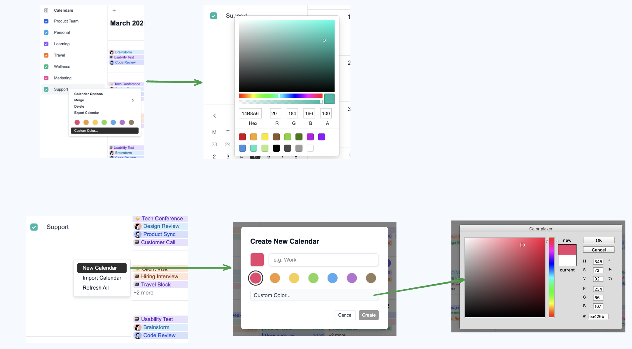
デフォルトでは、DayFlow は組み込みの BlossomColorPicker を使用します。react-color や vue-color などのライブラリを使用したい場合は、colorPicker スロットを使用して注入できます。
React の例
react-color をインストールします:
DayFlowCalendar に注入します:
ソースコードを表示
import { DayFlowCalendar } from '@dayflow/react';
import { SketchPicker, PhotoshopPicker } from 'react-color';

function MyCalendar() {
  return (
    <DayFlowCalendar
      calendar={calendar}
      colorPicker={args => (
        <SketchPicker
          color={args.color}
          onChange={color => args.onChange({ hex: color.hex })}
        />
      )}
      createCalendarDialogColorPicker={args => (
        <PhotoshopPicker
          color={args.color}
          onChange={color => args.onChange({ hex: color.hex })}
          onAccept={args.onAccept}
          onCancel={args.onCancel}
        />
      )}
    />
  );
}<template>
<DayFlowCalendar :calendar="calendar">
<template #colorPicker="args">
<SketchPicker
:color="args.color"
@change="color => args.onChange({ hex: color.hex })"
/>
</template>
<template #createCalendarDialogColorPicker="args">
<PhotoshopPicker
:color="args.color"
@change="color => args.onChange({ hex: color.hex })"
@accept="args.onAccept"
@cancel="args.onCancel"
/>
</template>
</DayFlowCalendar>
</template>
<script setup>
import { DayFlowCalendar } from '@dayflow/vue';
import { SketchPicker, PhotoshopPicker } from 'vue-color';
</script>import { Component } from '@angular/core';
import { DayFlowCalendarModule } from '@dayflow/angular';
@Component({
selector: 'app-root',
standalone: true,
imports: [DayFlowCalendarModule],
template: `
<dayflow-calendar
[calendar]="calendar"
[colorPicker]="picker"
[createCalendarDialogColorPicker]="dialogPicker"
>
</dayflow-calendar>
<ng-template #picker let-args>
<sketch-picker
[color]="args.color"
(change)="args.onChange({ hex: $event.hex })"
>
</sketch-picker>
</ng-template>
<ng-template #dialogPicker let-args>
<photoshop-picker
[color]="args.color"
(change)="args.onChange({ hex: $event.hex })"
(accept)="args.onAccept()"
(cancel)="args.onCancel()"
>
</photoshop-picker>
</ng-template>
`
})
export class AppComponent {
calendar = {
// ...
};
}<!-- App.svelte -->
<script lang="ts">
import { DayFlowCalendar } from '@dayflow/svelte';
import CustomColorPicker from './CustomColorPicker.svelte';
import CustomDialogColorPicker from './CustomDialogColorPicker.svelte';
</script>
<DayFlowCalendar
{calendar}
colorPicker={CustomColorPicker}
createCalendarDialogColorPicker={CustomDialogColorPicker}
/>
<!-- CustomColorPicker.svelte -->
<script lang="ts">
import type { ColorPickerProps } from '@dayflow/core';
import { SketchPicker } from 'svelte-color'; // 或者您喜欢的颜色选择器库
let { color, onChange } = $props<ColorPickerProps>();
</script>
<SketchPicker
{color}
onchange={colorResult => onChange({ hex: colorResult.hex })}
/>
<!-- CustomDialogColorPicker.svelte -->
<script lang="ts">
import type { CreateCalendarDialogColorPickerProps } from '@dayflow/core';
import { PhotoshopPicker } from 'svelte-color';
let { color, onChange, onAccept, onCancel } = $props<CreateCalendarDialogColorPickerProps>();
</script>
<PhotoshopPicker
{color}
onchange={colorResult => onChange({ hex: colorResult.hex })}
onaccept={onAccept}
oncancel={onCancel}
/>コンテキストメニュースロット
eventContextMenu と gridContextMenu スロットを使用すると、デフォルトの右クリックメニューを完全なカスタム React コンポーネントで置き換えられます。どちらのスロットも、メニューを閉じるための onClose コールバックを受け取ります。
eventContextMenu— ユーザーがイベントを右クリックしたときに発火します。{ event, onClose }を受け取ります。gridContextMenu— ユーザーがカレンダーグリッドの空白領域を右クリックしたときに発火します。{ date, viewType, onClose }を受け取ります。
任意のイベントまたは空のセルを右クリックして、カスタムメニューを確認してください:
ソースコードを表示
import { useCallback } from 'react';
import { DayFlowCalendar } from '@dayflow/react';
import type {
  EventContextMenuSlotArgs,
  GridContextMenuSlotArgs,
} from '@dayflow/core';

function MyCalendar() {
  const eventContextMenu = useCallback(
    ({ event, onClose }: EventContextMenuSlotArgs) => (
      <div className='custom-menu'>
        <button
          onClick={() => {
            /* 複製 */ onClose();
          }}
        >
          複製
        </button>
        <button
          onClick={() => {
            /* 共有 */ onClose();
          }}
        >
          共有
        </button>
        <button
          onClick={() => {
            calendar.deleteEvent(event.id);
            onClose();
          }}
        >
          削除
        </button>
      </div>
    ),
    []
  );

  const gridContextMenu = useCallback(
    ({ date, onClose }: GridContextMenuSlotArgs) => (
      <div className='custom-menu'>
        <button
          onClick={() => {
            /* ここにイベントを作成 */ onClose();
          }}
        >
          新しいイベント
        </button>
        <button
          onClick={() => {
            /* リマインダーを設定 */ onClose();
          }}
        >
          リマインダー
        </button>
      </div>
    ),
    []
  );

  return (
    <DayFlowCalendar
      calendar={calendar}
      eventContextMenu={eventContextMenu}
      gridContextMenu={gridContextMenu}
    />
  );
}<template>
<DayFlowCalendar :calendar="calendar">
<template #eventContextMenu="{ event, onClose }">
<div class="custom-menu">
<button @click="() => { /* 複製 */ onClose(); }">複製</button>
<button @click="() => { /* 共有 */ onClose(); }">共有</button>
<button @click="() => { calendar.deleteEvent(event.id); onClose(); }">削除</button>
</div>
</template>
<template #gridContextMenu="{ date, onClose }">
<div class="custom-menu">
<button @click="() => { /* ここにイベントを作成 */ onClose(); }">新しいイベント</button>
<button @click="() => { /* リマインダーを設定 */ onClose(); }">リマインダー</button>
</div>
</template>
</DayFlowCalendar>
</template>
<script setup>
import { DayFlowCalendar } from '@dayflow/vue';
</script>import { Component } from '@angular/core';
import { DayFlowCalendarModule } from '@dayflow/angular';
@Component({
selector: 'app-root',
standalone: true,
imports: [DayFlowCalendarModule],
template: `
<dayflow-calendar
[calendar]="calendar"
[eventContextMenu]="eventMenu"
[gridContextMenu]="gridMenu"
>
</dayflow-calendar>
<ng-template #eventMenu let-args>
<div class="custom-menu">
<button (click)="/* 複製 */ args.onClose()">複製</button>
<button (click)="/* 共有 */ args.onClose()">共有</button>
<button (click)="calendar.deleteEvent(args.event.id); args.onClose()">削除</button>
</div>
</ng-template>
<ng-template #gridMenu let-args>
<div class="custom-menu">
<button (click)="/* ここにイベントを作成 */ args.onClose()">新しいイベント</button>
<button (click)="/* リマインダーを設定 */ args.onClose()">リマインダー</button>
</div>
</ng-template>
`
})
export class AppComponent {
calendar = {
// ...
};
}<!-- App.svelte -->
<script lang="ts">
import { DayFlowCalendar } from '@dayflow/svelte';
import CustomEventMenu from './CustomEventMenu.svelte';
import CustomGridMenu from './CustomGridMenu.svelte';
</script>
<DayFlowCalendar
{calendar}
eventContextMenu={CustomEventMenu}
gridContextMenu={CustomGridMenu}
/>
<!-- CustomEventMenu.svelte -->
<script lang="ts">
import type { EventContextMenuSlotArgs } from '@dayflow/core';
let { event, onClose } = $props<EventContextMenuSlotArgs>();
</script>
<div class="custom-menu">
<button onclick={() => { /* 複製 */ onClose(); }}>複製</button>
<button onclick={() => { /* 共有 */ onClose(); }}>共有</button>
<button onclick={() => { calendar.deleteEvent(event.id); onClose(); }}>削除</button>
</div>
<!-- CustomGridMenu.svelte -->
<script lang="ts">
import type { GridContextMenuSlotArgs } from '@dayflow/core';
let { date, onClose } = $props<GridContextMenuSlotArgs>();
</script>
<div class="custom-menu">
<button onclick={() => { /* ここにイベントを作成 */ onClose(); }}>新しいイベント</button>
<button onclick={() => { /* リマインダーを設定 */ onClose(); }}>リマインダー</button>
</div>年ビュー Grid ポップアップ
年ビューが grid モードで gridDateClick: 'popup'(デフォルト)の場合、日付セルをクリックするとその日のイベントを一覧表示するポップアップが開きます。gridPopupContent スロットを使うと、このポップアップの中身を独自の UI に置き換えられます。
このスロットは <DayFlowCalendar> の prop として渡す必要があります。createYearView には渡さないでください。React や Vue などのフレームワークでレンダリングされたノードはスロットシステムを経由する必要があり、コアのビュー設定経由で渡すと Preact がクラッシュします。
import {
  useCalendarApp,
  DayFlowCalendar,
  createYearView,
  ViewType,
  type GridPopupContentSlotArgs,
} from '@dayflow/react';

function renderYearGridPopup({ date, events }: GridPopupContentSlotArgs) {
  return (
    <div className='rounded-xl border bg-white p-3 shadow-xl'>
      <div className='text-sm font-semibold'>{date.toDateString()}</div>
      {events.length === 0 ? (
        <div className='text-gray-400'>イベントなし</div>
      ) : (
        events.map(e => <div key={e.id}>{e.title}</div>)
      )}
    </div>
  );
}

function MyCalendar() {
  const calendar = useCalendarApp({
    views: [
      createYearView({
        mode: 'grid',
        gridDateClick: 'popup',
      }),
    ],
    defaultView: ViewType.YEAR,
  });

  return (
    <DayFlowCalendar
      calendar={calendar}
      gridPopupContent={renderYearGridPopup}
    />
  );
}