Content Slots
DayFlow uses a slot-based architecture that allows you to inject custom UI components from your preferred framework (React, Vue, etc.) directly into the core calendar engine.
This is powered by the ContentSlot mechanism. While the core engine provides default implementations for most UI elements (using Preact), you can override them to match your application's design or to use specific libraries.
Table of Contents
- How it Works
- Available Slots
- Event Content
- Event Detail Content
- Event Detail Dialog
- Mobile Event Detail
- Injecting a Custom Color Picker
- Context Menu
- Year View Grid Popup
How it Works
- Core Defines a Slot: Inside
@dayflow/core, certain UI areas are wrapped in aContentSlot. Each slot has ageneratorNameandgeneratorArgs. - You Provide the Implementation: You pass a component or a render function to the
DayFlowCalendarcomponent. The adapter then portals your component into the exact location defined by the core.
Available Slots
| Generator Name | Description | Arguments |
|---|---|---|
colorPicker | A small color picker used for event colors. | { color, onChange, onChangeComplete } |
createCalendarDialogColorPicker | A full-featured color picker used in dialogs. | { color, onChange, onAccept, onCancel, styles } |
eventContent* | Custom rendering for event cards (e.g. eventContentDay). | { event, viewType, isAllDay, isMobile, isSelected, isDragging, layout } |
eventContextMenu | Custom right-click context menu for events. | { event, onClose } |
eventDetailContent | The content shown in the popover/panel when event details open. | { event, isAllDay, onEventDelete, onEventUpdate, onClose, app } |
eventDetailDialog | Custom dialog shown when event details open. Requires useEventDetailDialog: true in useCalendarApp. | { event, isOpen, isAllDay, onEventDelete, onEventUpdate, onClose, app } |
gridContextMenu | Custom right-click context menu for calendar cells/grid. | { date, viewType, onClose } |
gridPopupContent | Custom popup content for Year view grid mode (when gridDateClick: 'popup'). | { date, events } |
mobileEventDetail | Custom mobile event detail drawer/dialog. | { isOpen, onClose, onSave, onEventDelete, draftEvent, app, timeFormat } |
sidebarCalendarColorPicker | A color picker used for calendar colors in the sidebar. | { color, onChange, onChangeComplete } |
titleBarSlot | Extra content in the sidebar title bar. | { isCollapsed, toggleCollapsed } |
Event Content
The eventContent slots allow you to completely customize how events are rendered within the calendar. Unlike other slots, event content must be specified per view to ensure the layout remains consistent with each view's specific event structure.
View-Specific Slots
| Slot Name | Description |
|---|---|
eventContentDay | Overrides timed events in Day view. |
eventContentWeek | Overrides timed events in Week view. |
eventContentMonth | Overrides events in Month view. |
eventContentYear | Overrides events in Year view. |
eventContentAllDayDay | Overrides all-day events in Day view. |
eventContentAllDayWeek | Overrides all-day events in Week view. |
eventContentAllDayMonth | Overrides all-day events in Month view. |
eventContentAllDayYear | Overrides all-day events in Year view. |
View Source Code
import { DayFlowCalendar } from '@dayflow/react'; // or '@dayflow/vue', '@dayflow/svelte', '@dayflow/angular'

export const EventContentShowcase = () => {
  return (
    <DayFlowCalendar
      calendar={calendar}
      // Customize event rendering for Day View
      eventContentDay={({ event, isSelected }) => (
        <div className='custom-event-card'>
          <span>{event.title}</span>
          {/* ... add your custom icons or layout */}
        </div>
      )}
      // Customize event rendering for Month View
      eventContentMonth={({ event }) => (
        <div className='flex items-center gap-1'>
          <span>🗓️</span>
          <span className='truncate'>{event.title}</span>
        </div>
      )}
      // Omit other view overrides for brevity...
    />
  );
};
Event Detail Content
The eventDetailContent slot lets you customize the content displayed in the event detail popover or panel when event details open.
View Source Code
import { DayFlowCalendar } from '@dayflow/react'; // or '@dayflow/vue', '@dayflow/svelte', '@dayflow/angular'
import { useCallback } from 'react';

export const CustomDetailPanelShowcase = () => {
  const detailPanel = useCallback(
    ({ event, onEventDelete, onEventUpdate, onClose }) => {
      return (
        <div className='p-4 space-y-3'>
          <h5 className='font-bold'>{event.title}</h5>
          <p>{event.description}</p>

          <div className='flex gap-2'>
            <button
              onClick={() => onEventUpdate({ ...event, title: 'Updated' })}
            >
              Update
            </button>
            <button onClick={() => onEventDelete(event.id)}>Delete</button>
          </div>
        </div>
      );
    },
    []
  );

  return (
    <DayFlowCalendar calendar={calendar} eventDetailContent={detailPanel} />
  );
};
Event Detail Dialog
If you prefer a modal/dialog interface for viewing and editing event details, you can use the eventDetailDialog slot. This is particularly useful for mobile-first applications or when you need more space for complex event data.
Prerequisite: set
useEventDetailDialog: trueinuseCalendarAppto activate dialog mode. Without it the slot is never triggered.
Opt out instead: if you want to suppress the built-in floating panel without replacing it with your own dialog, set
useEventDetailPanel: falsein youruseCalendarAppconfiguration instead of using a slot.
View Source Code
import { DayFlowCalendar } from '@dayflow/react'; // or '@dayflow/vue', '@dayflow/svelte', '@dayflow/angular'
import { useCallback } from 'react';

export const CustomDetailDialogShowcase = () => {
  const customDialog = useCallback(({ event, isOpen, onClose }) => {
    if (!isOpen) return null;

    return (
      <div className='fixed inset-0 z-50 flex items-center justify-center bg-black/50'>
        <div className='bg-white p-6 rounded-lg shadow-xl'>
          <h2>{event.title}</h2>
          {/* ... build your custom dialog UI here */}
          <button onClick={onClose}>Close</button>
        </div>
      </div>
    );
  }, []);

  return (
    <DayFlowCalendar calendar={calendar} eventDetailDialog={customDialog} />
  );
};
Mobile Event Detail
When DayFlow is viewed on mobile devices (or small screens), it uses a dedicated mobileEventDetail slot to handle event creation and editing. By default, this is a full-screen drawer.
Tap an event to open the mobile drawer. This showcase runs in an iframe so DayFlow reads a real mobile viewport instead of the desktop window.
View Source Code
import { DayFlowCalendar } from '@dayflow/react';
import { useCallback } from 'react';
export const MobileEventDetailShowcase = () => {
const customMobileDrawer = useCallback(
({ isOpen, onClose, onSave, onEventDelete, draftEvent }) => {
if (!isOpen || !draftEvent) return null;
return (
<div className='fixed inset-0 z-50 flex flex-col bg-white'>
<header className='flex items-center justify-between p-4 border-b'>
<button onClick={onClose}>Back</button>
<h2>{draftEvent.id ? 'Edit' : 'New'} Event</h2>
<button onClick={() => onSave(draftEvent)}>Save</button>
</header>
<div className='p-4'>
<input
defaultValue={draftEvent.title}
onChange={e => (draftEvent.title = e.target.value)}
/>
{/* ... build your mobile-optimized UI */}
</div>
</div>
);
},
[]
);
return (
<DayFlowCalendar
calendar={calendar}
mobileEventDetail={customMobileDrawer}
/>
);
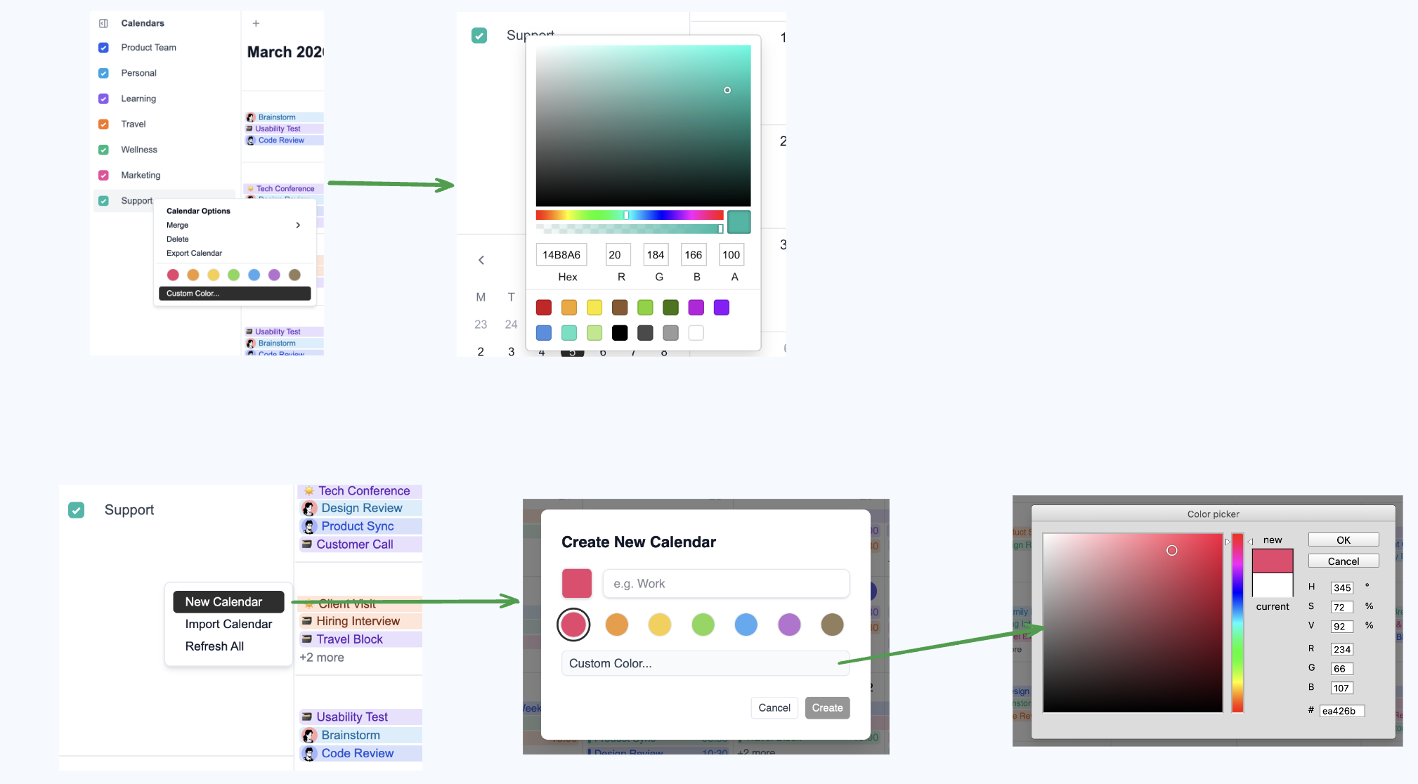
};Example: Injecting a Custom Color Picker
By default, DayFlow uses a built-in BlossomColorPicker. If you prefer to use a library like react-color or vue-color, you can inject it using the colorPicker slots.
React Example
Install react-color:
Inject it into DayFlowCalendar:
View Source Code
import { DayFlowCalendar } from '@dayflow/react'; // or '@dayflow/vue', '@dayflow/svelte', '@dayflow/angular'
import { SketchPicker, PhotoshopPicker } from 'react-color';

function MyCalendar() {
  return (
    <DayFlowCalendar
      calendar={calendar}
      colorPicker={args => (
        <SketchPicker
          color={args.color}
          onChange={color => args.onChange({ hex: color.hex })}
        />
      )}
      createCalendarDialogColorPicker={args => (
        <PhotoshopPicker
          color={args.color}
          onChange={color => args.onChange({ hex: color.hex })}
          onAccept={args.onAccept}
          onCancel={args.onCancel}
        />
      )}
    />
  );
}
Context Menu Slots
The eventContextMenu and gridContextMenu slots let you replace the default right-click menus with fully custom React components. Both slots receive an onClose callback to dismiss the menu.
eventContextMenu— triggered when the user right-clicks an event. Receives{ event, onClose }.gridContextMenu— triggered when the user right-clicks an empty area of the calendar grid. Receives{ date, viewType, onClose }.
Right-click on any event or empty cell to see the custom menus in action:
View Source Code
import { DayFlowCalendar } from '@dayflow/react';
import type {
  EventContextMenuSlotArgs,
  GridContextMenuSlotArgs,
} from '@dayflow/core';
import { useCallback } from 'react';

function MyCalendar() {
  const eventContextMenu = useCallback(
    ({ event, onClose }: EventContextMenuSlotArgs) => (
      <div className='custom-menu'>
        <button
          onClick={() => {
            /* duplicate */ onClose();
          }}
        >
          Duplicate
        </button>
        <button
          onClick={() => {
            /* share */ onClose();
          }}
        >
          Share
        </button>
        <button
          onClick={() => {
            calendar.deleteEvent(event.id);
            onClose();
          }}
        >
          Delete
        </button>
      </div>
    ),
    []
  );

  const gridContextMenu = useCallback(
    ({ date, onClose }: GridContextMenuSlotArgs) => (
      <div className='custom-menu'>
        <button
          onClick={() => {
            /* create event at date */ onClose();
          }}
        >
          New Event
        </button>
        <button
          onClick={() => {
            /* set reminder */ onClose();
          }}
        >
          Remind me
        </button>
      </div>
    ),
    []
  );

  return (
    <DayFlowCalendar
      calendar={calendar}
      eventContextMenu={eventContextMenu}
      gridContextMenu={gridContextMenu}
    />
  );
}
Year View Grid Popup
When the Year view runs in grid mode with gridDateClick: 'popup' (the default), clicking a date cell opens a popup listing that day's events. The gridPopupContent slot lets you replace that popup's body with your own UI.
The slot must be passed as a prop on <DayFlowCalendar> — not in createYearView. Framework-rendered nodes (React, Vue, etc.) must flow through the slot system; passing them through the core view config will crash Preact.
import {
  useCalendarApp,
  DayFlowCalendar,
  createYearView,
  ViewType,
  type GridPopupContentSlotArgs,
} from '@dayflow/react';

function renderYearGridPopup({ date, events }: GridPopupContentSlotArgs) {
  return (
    <div className='rounded-xl border bg-white p-3 shadow-xl'>
      <div className='text-sm font-semibold'>{date.toDateString()}</div>
      {events.length === 0 ? (
        <div className='text-gray-400'>No events</div>
      ) : (
        events.map(e => <div key={e.id}>{e.title}</div>)
      )}
    </div>
  );
}

function MyCalendar() {
  const calendar = useCalendarApp({
    views: [
      createYearView({
        mode: 'grid',
        gridDateClick: 'popup',
      }),
    ],
    defaultView: ViewType.YEAR,
  });

  return (
    <DayFlowCalendar
      calendar={calendar}
      gridPopupContent={renderYearGridPopup}
    />
  );
}